- Ensure messaging is succinct and only use when necessary to provide an explanation for an interface element.
- Use tooltips consistently throughout the page.
- Consider clarifying the design and language if you require lots of tooltips.
Tooltip
A tooltip is a contextual message that appears when users interact with an element, providing additional information or guidance.
Dos and Don'ts
- Don’t use tooltips to communicate errors or critical information.
- Do not use tooltips to restate visible UI text.
Anatomy
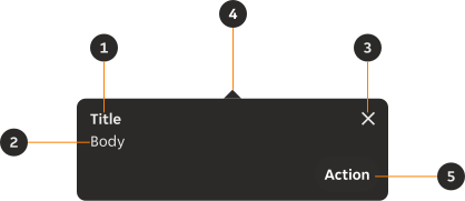
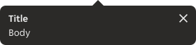
- Title (Optional): Provides overall context of the content.
- Body copy: Provides supporting information to the user.
- Close icon (Optional): Allows the user to dismiss the tooltip.
- Pointer: A visual link between the tooltip container and the trigger element.
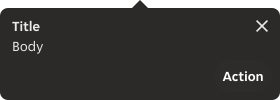
- Button (Optional): A button to outline the user's next options.
Variants
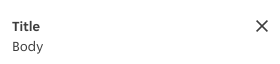
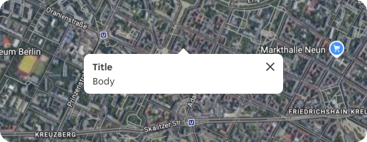
Ensure the correct variation of the tooltip is used depending on the background content to ensure enough contrast.
Default
Used on light backgrounds or containers.
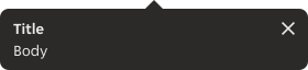
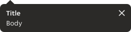
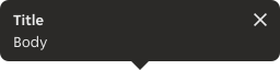
Inverse
Used on dark backgrounds or containers.
Modifiers
Pointer placement
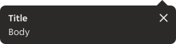
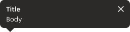
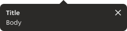
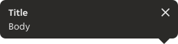
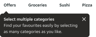
A tooltip can open at the top, bottom, left or right depending on the position of the UI trigger on the screen. In addition, we can select the alignment to the associated UI element. The UI element can be aligned to the start, centre or end of the tooltip container depending on the space available.
By default, the tooltip opens from the bottom, which means the pointer is positioned top-centre.
- Ensure tooltips are clearly positioned in relation to their trigger or related content.
- Avoid placing a tooltip over any important information.
- Avoid placing a tooltip over any navigation.
- Avoid the tooltip extending off the page and getting cropped.
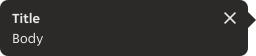

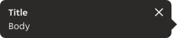

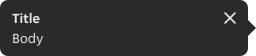

Title
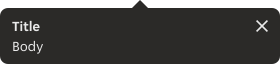
The title can be removed where it is not necessary.
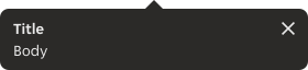

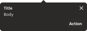
Action
Tooltips can offer a single action through the use of a button.
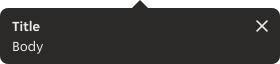
Close
For tooltips that need to be closed manually.

Sizes
Width
Predefined
By default, tooltips have a fixed width of 280px and are not dynamic with the content or container.
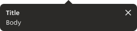
Fit to content
The width of the container is dynamic to the width of the content and retains 12px left and right padding if there is no close icon, and 8px to the right if there is a close icon.

Fill container
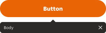
The width is 100% of the container in which the trigger and tooltip are placed, and can only be applied to top and bottom tooltips.
Placement
Offset
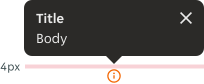
By default the tooltip has 4px offset between the pointer and the associated UI element. User can override the offset if needed.
Position
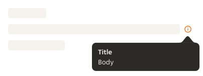
If the trigger appears near to the edge of the interface, the tooltip will open from a different position or adjust its alignment to avoid cropping, bleeding off the page or covering important information.
Behaviours
Trigger
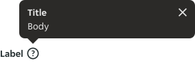
A trigger can be any UI element, such as a standalone icon, icon button or text.
- Tooltips are triggered by tapping.
- Tooltips can also be triggered automatically by the system, without any manual input from the user.
Close
Auto-dismiss
The tooltip will automatically disappear 1500ms after being triggered. Since the user cannot manually dismiss it, the close function has been removed.

Persistent
If the tooltip includes a close icon or button, the tooltip can remain persistent until the user manually dismisses it or taps outside of the tooltip.
Only one tooltip at a time
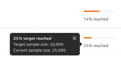
If more tooltips need to be displayed, the previous tooltip will be dismissed when the new tooltip is triggered, even if the tooltips are persistent.
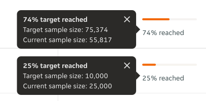
Interactions
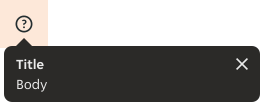
Trigger
When a tooltip is manually triggered, the touch target area must be at least 48px by 48px to ensure accessibility. If the UI element is smaller than this size, the touch target area can extend beyond the visible element.
Close
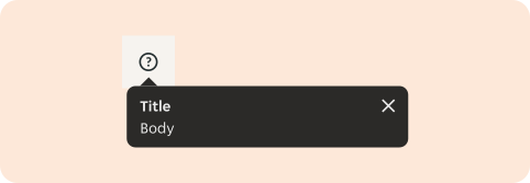
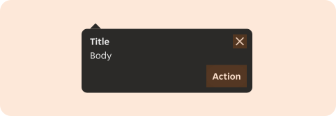
A tooltip can be closed in one of three ways: by tapping on the close icon, by tapping on the action button or outside the tooltip.
Content
- All content should use sentence case.
- Tooltip messages should be brief, always using clear and concise phrasing.
- Should not contain crucial information. Important information should always be visible, not hidden in tooltips.
- The title should aim to be kept between one to two lines of text.
- The body copy should aim to not exceed 4 lines of text.
- The body copy weight can be increased to highlight specific pieces of text within the content.
Overflow
If the content exceeds the available width, the title and body copy wrap to a new line. Content will be left aligned.
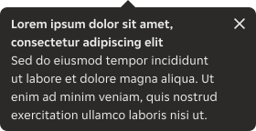
Examples
LTR examples
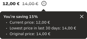
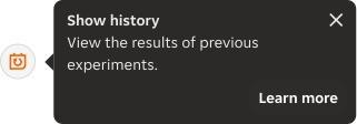
Here are some examples of the component in left-to-right context:
RTL examples
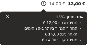
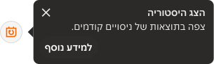
Here are some examples of the component in right-to-left context: