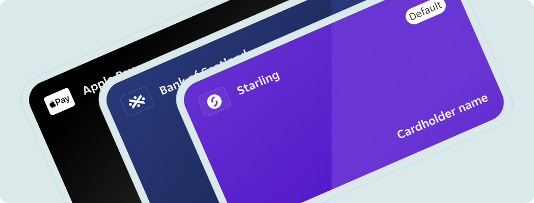
- Stack multiple payment method components where needed.
Payment Method Card
Graphic element that displays a payment method such as digital wallet, credit or debit card.
Overview
The payment method card displays the user’s payment method information.
Dos and Don'ts
- Don't override icon and background pairings. If you need a new variant please follow this process.
- Don't resize the component.
Anatomy
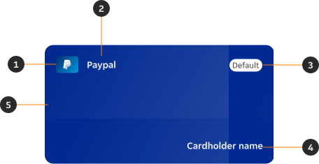
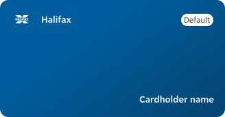
- Icon: Displays the icon associated with the payment method.
- Payment method name: Displays the name associated with the payment method.
- Status: Changes based on the validity or user preferences of the payment method card.
- Cardholder name: Displays the name issued on the card.
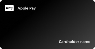
- Background: Displays the background colours associated with the payment method's brand.
Variants
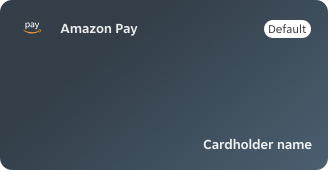
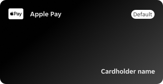
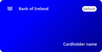
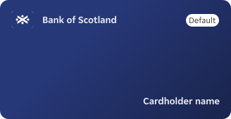
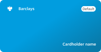
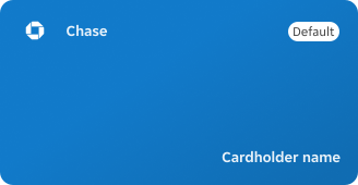
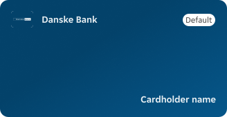
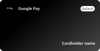
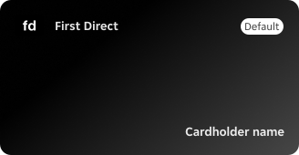
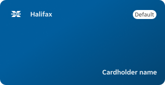
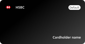
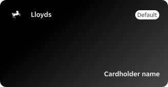
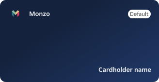
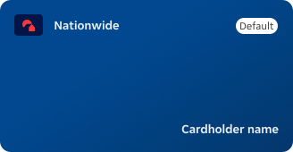
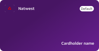
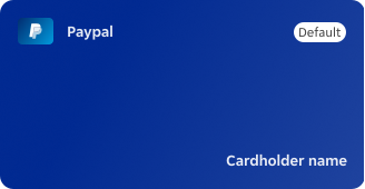
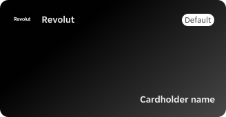
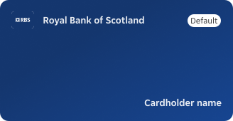
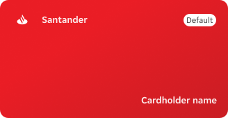
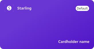
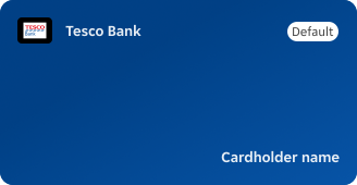
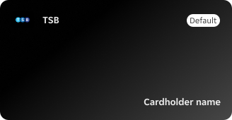
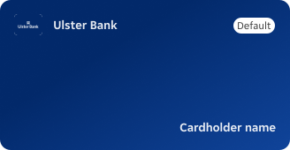
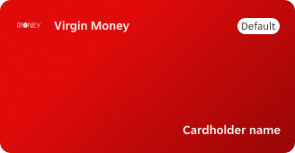
States
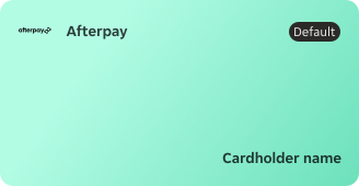
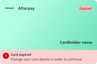
Each variant of the payment method card has three states: default, non-default and expired.
Sizes
Resizing the component is not needed. The component follows the size and shape of a physical card.
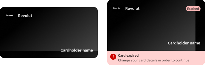
Height
- Minimum height of 170px when on default state.
- Height increases to 218px when displaying the expired state.
Width
- Maximum width of 328px, allowing for proportional scaling if necessary.
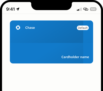
Narrow screens
In narrow screens the payment method card uses the original component size.
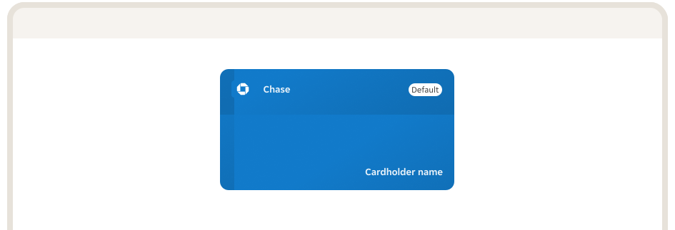
Wide screens
In wider screens the payment method card remains the same size.
Icon size
The payment method icon follows the size and proportions of the original Icon / Payment method (32x24px) component that is nested.

Content
Icon
Size and proportions remain unchanged from the payment method icons in our Icons library.
Background
- Asset used for the background needs to be sourced from the pillar repository, not from the PIE repository.
- The available background assets are to be used as reference and are not available for production.
- Follow the guidelines to create and maintain new payment method card background assets. Contact the design system team for the link.
Cardholder name
Text string shouldn't break into 2 lines.
Overrides
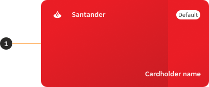
- Elevation: An elevation token can be added based on placement and positioning in relation to other elements.
Behaviour
Shimmer effect
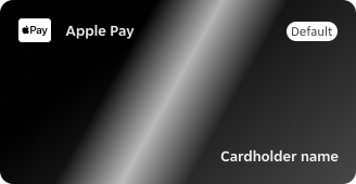
The shimmer effect from the Skeleton component can be utilised as a moment of delight.
Layout
Stacking
Component can be resized proportionally only while stacking multiple cards.
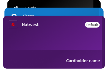
Examples
LTR
Here are some examples of Payment method card in left-to-right context.
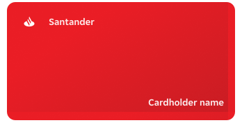
RTL
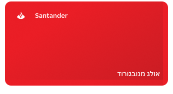
In right-to-left context the payment method card component remains the same but cardholder name changes direction.