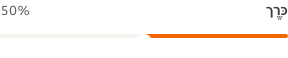
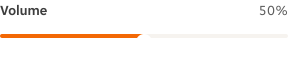
- Always visually highlight the selected value within the trailing label of the form label, ensuring the user can easily see their precise choice.
Slider
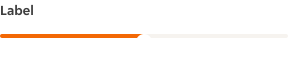
A slider is an interactive element for selecting values or ranges by dragging a handle along a track.
Dos and Don'ts
- Don’t use when an element is displaying the status or completion of a task, using the Progress Bar instead.
- Don't use when exact values are critical. If a user must select an exact number, a text input is usually more appropriate.
Anatomy
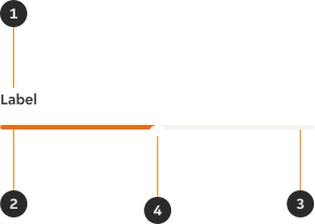
- Form label (optional): The form label provides necessary content / information to a form.
- Progress line: Illustrates the visual representation of the selection.
- Progress container: Shows a user’s available minimum and maximum values on the range to select from.
- Handle: An indicator that can be moved on the track within the slider range to specify a selected value.
Variants
Default
Modifiers
Tick marks
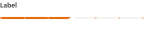
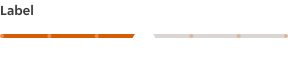
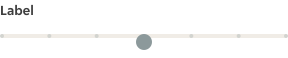
Tick marks are used to indicate specific values, providing users with clear reference points to move their handle to.
Interactions
Users can adjust the handle's position by either dragging it along the progress container or tapping directly on a specific point within the container to reposition the handle.
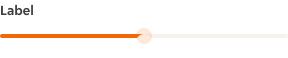
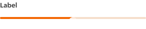
Interactive states
Outlines the atomic level interactive elements for the component.
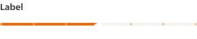
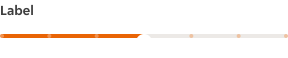

Examples
LTR examples
Here are some examples of the component in left-to-right context:
RTL examples
Here are some examples of the component in right-to-left context: