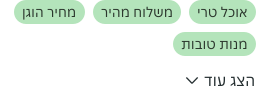
- Use only as a block, not inline.
- Use to save space while preserving visual balance and maintaining information hierarchy.
Show More
A show more component is an interactive element that allows users to expand or reveal additional content initially hidden or truncated.
Dos and don'ts
- Don't use if entire content needs to be expanded or collapsed. Use an Accordion instead.
Anatomy

- Label: Text label informing the user about the nature of the link.
- Chevron icon: Visually support the Label.
Variants
Default
Position
Always place the component below the paragraph or sentence. It does not support being inline with content.

Behaviours
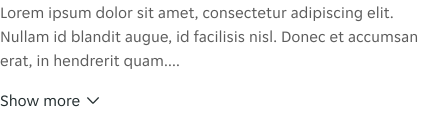
The component was designed to be collapsed by default, but can be modified to be expanded by default. Consider context and the role the content plays when deciding which option is best.
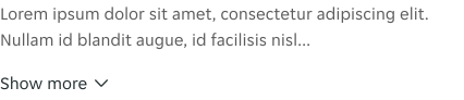
Tapping "Show More" reveals the hidden content at the bottom of a paragraph. When this component is expanded, the text changes to "Show Less," and the chevron flips to show the direction of the previously hidden content.
States
Outlines the atomic level interactive elements for the component.
Show more
Show less

Examples
LTR examples
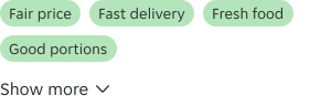
Here are some examples of the component in left-to-right context:
RTL examples
Here are some examples of the component in right-to-left context: