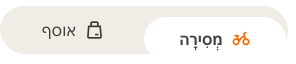
- Use when a segment always has to be selected. If a selection isn't required use a Radio Button group.
- Limit the number of segments to improve usability.
- Test the segmented control on small screen sizes of 320px and with all expected translations.
Segmented Controls
A segmented control is a navigation or input element that presents a set of mutually exclusive options in a segmented layout.
Dos and Don'ts
- Do not allow segments to truncate; the entire label should be displayed. If the content doesn't fit within the segments, we recommend using other solutions.
Anatomy
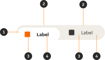
- Container: Fluid or fixed width.
- Segment: Displays all options, and highlights the selected segment clearly. One segment must always be selected.
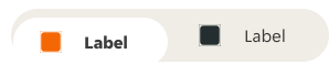
- Icon (Optional): Icon that can be used to visually support the string.
- Label: Describes the item you want to select or unselect.
Variants
Default
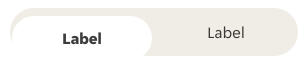
Modifiers
Segments
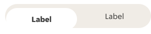
The minimum number of segments is two, with a maximum number of four. If you need to use more than four segments then we suggest finding a different solution.

Icons
Icons are always positioned to the left of the string and only used if they visually support the label.
Sizes
Height
Large
- Height min: 48px
- Height max: 64px (overflow)
- Use cases: Default, and primary action.
Small
- Height min: 32px
- Height max: 52px (overflow)
- Use cases: Secondary action, or limited space on the page.
Width
Fixed
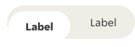
Container width is flexible and will fit the individual width of the segments. Segments will retain a 24px left and right padding as default.
Fluid
Left and right segment padding is automated depending on the fluid width of the container.

Content
Labels
- Segmented control labels should always be as succinct as possible but clear enough that the user fully understands what is being selected; avoid using multiple words where possible.
- Use sentence-style capitalisation (only the first word in a phrase and any proper nouns capitalised).
- As much as possible, use content with a similar size in each segment to avoid the component feeling unbalanced or disjointed.
- It is highly encouraged that label translations be tested on different screen sizes.
Overflow
Singular word overflow
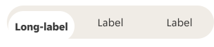
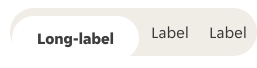
For designers trying to create more space for a singular word overflow: remove the icons to give the label more room. Where necessary, such as on smaller screens and using more than two segments, we allow the left and right padding to decrease to 4px to allow more space for the label to comfortably fit within the segment. Designers should override our default padding to accommodate this in their designs.
Segments should always be the same height and of equal width, with the label centre aligned within the segments.
Multiple word overflow
When a group of words extend beyond the available horizontal space, the text automatically wraps onto a new line. This should never exceed two lines.
Segments should always be the same height and of equal width, with the label centre aligned within the segments.


Interactive states
Outlines the atomic level interactive elements for the component.

Examples
LTR examples
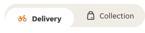
Here are some examples of segmented control in left-to-right context.

RTL examples
Here are some examples of segmented control in RTL context.