- For a long operation or a process that can take a considerable or unknown amount of time.
- When the process can be described with quantitative information, such as a percentage.
- To visually show the progression of a system operation such as downloading, uploading, loading data, submitting a form, or saving updates.
- To convey that data is being requested, transferred, or processed.
Progress Bar
A progress bar is a visual element that represents the progress or completion status of a task, process or operation.
Dos and Don'ts
- When manual user actions are required to progress, use the Progress Stepper instead.
- If the process takes longer than 5 seconds to load, use the Spinner instead.
Anatomy
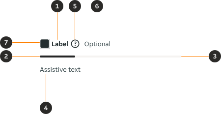
- Form label (Optional): The form label provides clear and concise information to describe the contents of the field.
- Progress line: Visually illustrates the current progress.
- Track (Optional): Flexible width determined by the designer or available screen space.
- Assistive text (Optional): The assistive text provides additional instructional information, as well as error and success messages.
- Help or info tooltip icon (Optional): A small interactive icon users can tap to see extra information about the progress bar content.
- Optional trailing text (Optional): A text label aligned to the end of the progress bar to inform the user the field is optional.
- Leading icon (Optional): Leading icon that visually supports the label.
Variants
Default
Determinate progress bars fill the container from 0 to 100%. This reflects the progress of the process.

Indeterminate
Indeterminate progress bars display movement along the container until the process is finished.

Modifiers
Colour
Secondary

Brand

Track
The progress bar's track is removable for specific use cases, but this should not be the default. When the track is removed, the progress bar must reside within a fixed-width container that visually indicates its potential full width. This choice requires careful consideration.

Label with leading icon
The leading icon is available within the form label nested component. By default the colour of the leading placeholder icon is the same as the text. The colour of the placeholder icon can be overridden.

Examples
LTR example
Here are some examples of a progress bar in LTR context.


RTL example
Here are some examples of a progress bar in RTL context.

