- Make sure you use the correct size for its placement, whether it's in a list, stand-alone, or any other context.
Icon With Background
An icon with a background is a visual element that combines an icon symbol with a shape behind it.
Dos and don'ts
- Don't use this component as avatar. For this use case, use the [App] Avatar - icon or [Web] Avatar - icon components instead.
- Don't use this component as button or interactive solution. For this use case, use the [App] Icon button or [Web] Icon button component instead.
Anatomy
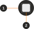
- Container: Background container that organises the information.
- Icon: Icon that visually represents the action and/or supports the written content.
Variants
Two shape options are available for icons with a background.
Circle

Square

Modifiers
Emphasis
Depending on the level of visual prominence you want to give to the icon's background, you can choose between strong or subtle emphasis.


Colours
Select from a palette of distinct brand colours for the icon.












Sizes
Circle


Square


Interactive states


Examples
LTR example
Here are some examples of the icon with background in LTR context:

RTL example
Here are some examples of the icon with background in RTL context: