- Use them mainly to perform actions, and for searching or filtering content.
- Use them sparingly when placed in forms, and only when you need search or filtering functionalities.
- Use them when screen real estate is limited.
- Use clear labels.
Dropdown
A dropdown displays a list of options for users to choose from, enabling them to perform actions, filter content, or sort information.
Dos and don'ts
- If most of your experience is form-based or frequently used on mobile platforms, use Select Input instead.
- Don't use Dropdowns when there are fewer than three options. Use Radio Buttons instead.
- Don't add more than 7 options visible at the same time inside the popover as it will become overwhelming for the user.
Anatomy
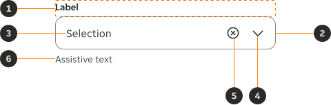
- Form label (optional) : The Form Label provides a clear and concise information to describe the contents of the field.
- Dropdown field: Acts as the main interactive area of the component, where the user's selection and controls for the Dropdown live.
- Placeholder/Selection: Indicates the placeholder text or option selected by the user.
- Chevron icon: Used to indicate there is additional content revealed when interacting with the dropdown.
- Clear icon (optional): Clears the user's selection when clicked.
- Assistive text (optional): The Assistive Text provides additional instructional information, as well as error and success messages.
- Focus ring: Used to indicate the user is currently interacting with the Dropdown.
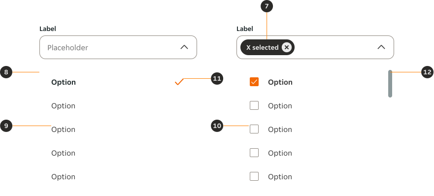
- Chip (optional): Our Chip component is used to indicate the number of selected items in all multiple selection variants of the Dropdown.
- Dropdown popover: Contains a list of selectable options for the user to choose from.
- Option: These represent the available selections that the user can choose from.
- Checkbox (optional): The Checkbox component acts as a visual cue to indicate the user has selected an option.
- Check icon (optional): Used to indicate that an option has been selected more clearly.
- Scrollbar (optional): Allows users to scroll through the content when there are more options than can be displayed in a single view.
Variants
Default dropdown
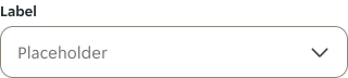
Use our default Dropdown variant when you need to present a list of options or choices to the user, so they can select one or more of them.
Multi-select dropdown
Use multi select dropdown variant when you need to present a list of options or choices to the user, so they can select multiple options.
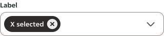
Search dropdown
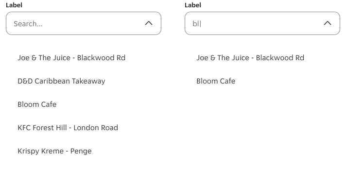
This variant allows our users to type and search for specific options by providing a text input field within the dropdown. This enables users to filter the available options based on their input.
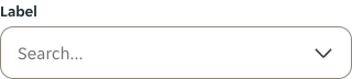
Search multi-select dropdown
This variant allows our users to type and search for specific options by providing a text input field within the dropdown. This enables users to filter the available options based on their input and select multiple options.
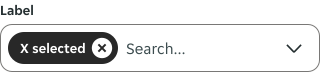
Modifiers
General modifiers
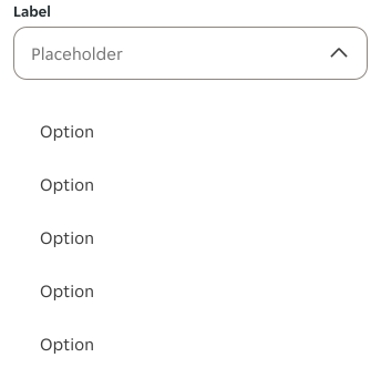
Expanded
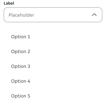
Use this modifier when you want to show the options the user can select after interacting with the Dropdown.
Content
Use this modifier when you want to show a Dropdown where the user has already selected an option.

Field modifiers
Label
You can remove the label in situations where the dropdown's purpose is already clear and there are contextual clues, or when space needs to be conserved.

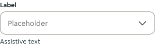
Assistive text
Use the assistive text modifier to provide additional information which can help the user figure out the option they need to select.
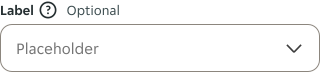
Label details
Use label details to provide additional information, such as marking the dropdown as optional.
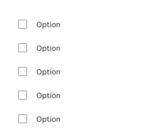
Popover modifiers
Multi-select
Use this modifier when you want to allow users to make multiple selections from a list of options simultaneously.
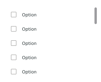
Scrollable
When the number of options exceeds the available space within the popover, use the Scroll modifier to indicate that there are additional options available.
Loading
Use this modifier to reflect the Dropdown is retrieving or processing information based on the user input. This helps manage the user's expectations, improving responsiveness and maintaining visual continuity.

Option modifiers
Multi-select
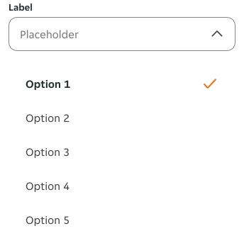
In the single-selection version, you can visually indicate a selected option with a check mark symbol. This helps the user understand which selection is active.

Selected
Use this modifier to indicate one or more options have been selected.
In the single-selection version, the selected option's text is bold and is followed by a check mark icon.
For the multiple-selection version, the selected option's text is bold and the checkbox's state becomes selected.

Sizes
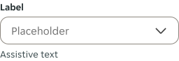
Small
Field height of 40px.
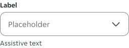
Medium
Field height of 48px.
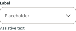
Large
Field height of 56px.
Interactive states
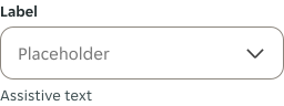
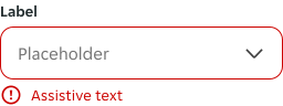
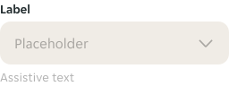
Field states
Option states

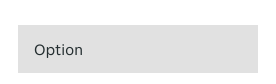
Behaviours
Expand
This will expand the Dropdown by clicking or tapping on its field. This will open or close the dropdown, revealing or hiding the options in a popover.
Selection
When the user selects an option, it will be displayed in the field, replacing the initial placeholder text.
Search
As the user types in the search field, the options are dynamically updated to display matching results.
Interactions
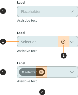
- Clear selection: Clicking or tapping on this area will remove any selected options.
- Open/Expand the dropdown: Represents the placeholder text or value selected by the user.
Contents
Below you can find some do's and don'ts which can help you write better dropdown labels, placeholder text and selectable options:
- Use clear and concise labels that accurately describe the purpose or content of the dropdown.
- Provide informative placeholder text that guides users on the expected input or selection.
- Use meaningful and descriptive option labels that accurately represent the available choices.
- Organise options in a logical and intuitive order, such as alphabetical or hierarchical grouping, to facilitate easy scanning and selection.
- Consider user context and language preferences when writing labels and option text to ensure inclusivity and localisation.
- Don't use vague or ambiguous labels that can confuse users about the purpose or expected input of the dropdown.
- Don't leave the placeholder text empty or provide placeholder text that doesn't provide any meaningful guidance.
- Don't use lengthy or excessive option labels that can create visual clutter and make it harder for users to scan and select options quickly.
Using the Dropdown in form layouts
When you place a Dropdown in a form using auto layout, you'll sometimes need to show the expanded version of the component in context. Unfortunately, this will push down all your contents.
In order to prevent this, please follow these steps:
- Toggle the 'Expanded' property in Figma's design panel (right hand panel).
- Add the contents you need in the popover.
- Detach the component (don't worry, you'll still have editing capabilities).
- Select the popover and assign it an absolute position.
RTL
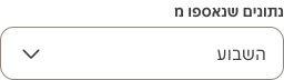
For right-to-left (RTL) languages, the layout of the Dropdown is mirrored. The chevron icon is left-aligned and the label and placeholder text are right-aligned.