- Use buttons when you need to direct the user to an action.
- When pairing buttons, use the same sized buttons together.
Button
A button is a clickable element in a user interface that triggers an action when pressed.
Dos and Don'ts
- Do not use buttons as navigational elements. Instead, use links when the desired action is to take the user to a new page.
Anatomy

- Icon (optional): Leading or trailing that visually supports the label.
- Label: Informs the user of the action.
Variants
Primary
The primary call-to-action on the page, should be singular and prominent, limited to one per page. Used on crucial moments in the user flow such as a sign up, checkout, user agreement, etc.

Primary - alternative
The primary call-to-action on the section, should be singular and prominent. It should be reserved for the most critical actions expected from the user, such as "Next," "Save," "Submit," etc.

Primary - alternative dark
Primary-alternative dark has the same properties as Primary-alternative, however are used when the background colour remains ‘light’ on the dark theme, as the label remains ‘dark’ to provide enough contrast.

Secondary
Secondary buttons serve as supplementary options for secondary, non-essential actions on a webpage. They can be utilised independently or in conjunction with a primary button.

Outline
Outline buttons are designed to provide increased emphasis compared to ghost buttons, owing to their visible stroke. They can be utilised either as standalone buttons or in combination with a primary button.

Ghost
Ghost buttons are commonly employed for actions that are considered less crucial. They can be used independently or in tandem with a primary button. They are ideal for repetitive actions, such as an edit button on a recurring card.

Ghost secondary
Ghost secondary buttons are similar to the ghost button, but are less prominent because they have a different colour for the leading and trailing icons.

Ghost dark
Ghost dark buttons have the same purpose as the ghost buttons. However are used when the background colour remains ‘light’ on the dark theme, as the label remains ‘dark’ to provide enough contrast.
Destructive
Destructive buttons are used for high impact deletion that can result in permanent or undesirable consequences, limited to one per page.

Destructive ghost
Destructive buttons are used for high impact deletion that can result in permanent or undesirable consequences, limited to one per page.

Inverse
Inverse buttons are specifically designed to be used on backgrounds with colours or images, and it's recommended to limit their usage to just one per page. They are reserved for the most critical actions, such as "Next," "Save," "Submit," etc.

Outline inverse
Outline inverse buttons are used to signify a secondary action. They can be utilised independently or in conjunction with an inverse button.

Ghost inverse
Ghost inverse buttons are intended for utilisation on backgrounds with colours or images, and are usually reserved for actions of lesser significance. They can be used independently or in conjunction with a primary button. Ghost inverse buttons are ideal for repetitive actions, such as an edit button on a repeating card.

Ghost inverse light
Ghost inverse light buttons have the same purpose as the ghost inverse buttons. However are used when the background colour remains ‘dark’ in on the dark theme, as the label remains ‘light’ to provide enough contrast.

Modifiers
Icons
When incorporating an icon into a Button, it is essential to ensure that the icon clearly conveys the intended action of the Button. The icon should be directly related to the action the user is taking, helping to reinforce the Button's purpose. Additionally, the colour of the icon must match the colour of the text label within the Button to maintain consistency.


Leading
Leading icon provides context and visually supports the label.

Trailing
Trailing icon can indicate further interaction, such as opening up a popover or bottom sheet.

Leading and trailing
In some cases, leading and trailing icons can be used together, as long as their purposes are clear.


Use a leading icon to visually support the label, and a trailing icon to indicate an additional interaction.
Don’t use both leading and trailing icons to visually support the label.
Icon sizes
Icons have different size depending on the size of the button.
| Button size | Icon size |
|---|---|
| Large & Medium | 24px |
| Small (Expressive & Productive) | 20px |
| XSmall | 16px |
Width
Fixed
Container width is fixed to fit the Button's label that retains 24px left and right padding.

Fluid
Left and right padding is automated depending on the fluid width of the container.

Sizes
Outlines the Button sizes that are available, and where they should be used across our products.
| Button size | Height | Use cases |
|---|---|---|
| Large | 56px | Typically used on Wide resolutions. Search input fields. Available in full width. |
| Medium | 48px | Primary page actions and other stand alone actions. Medium is the default size of the button and is available in full width. |
| Small - Expressive | 40px | Larger expressive font size used for increased emphasis. Available in full width. |
| Small - Productive | 40px | Larger expressive font size used for increased emphasis. Available in full width. |
| XSmall | 32px | Larger expressive font size used for increased emphasis. Available in full width. |
Responsive sizes
Button sizes can adapt to different screen widths, like wide and narrow views, but there are some restrictions. When buttons resize, they can only transition by one size category, such as going from Large to Medium. Additionally, they can only grow larger when transitioning to wider viewports, not the other way around.
Content
Labels
Button labels should clearly indicate the action of the Button and describe what will occur once the user clicks the Button. Use active verbs, such as Add or Delete. For sets of buttons, use specific labels, such as Save or Discard, instead of using OK and Cancel. This is particularly helpful when the user is confirming an action.
Use sentence-style capitalisation (only the first word in a phrase and any proper nouns capitalised).
Overflow
Singular word overflow
When a single word extends beyond the the available horizontal space, the word truncates and an ellipsis is displayed.

Multiple words overflow
When a group of words extends beyond the available horizontal space, the text automatically wraps onto a new line, with no maximum height restriction.

Hierarchy
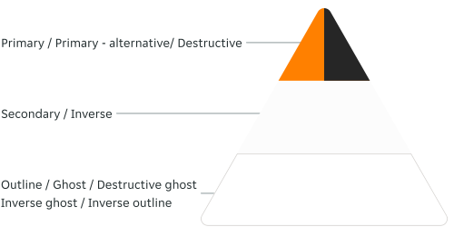
Buttons should follow a hierarchy of importance with regards to the action that is being committed by the user and how the Buttons are paired together.
Multiple Button pairing
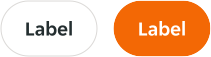
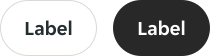
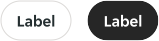
When pairing Buttons, they should always have a relationship to one another; with the highest hierarchy Button is always positioned on the right / top depending on if the button pair is stacked with a 16px spacing between. Always ensure the same sized Buttons are paired together.
Button pairing options are:
-
A high-emphasis Button with a medium / low-emphasis Button that performs a less important action.
-
A medium-emphasis Button with a low-emphasis Button that performs a less important action.



Layout
Alignment
The alignment of Buttons depends on where they appear and whether or not they're container within another component.
As a general rule, on full-page designs the primary Button is on the left side of the page, as it's best to have the Button where the user's attention has been focused all along. Whereas in Modals, the primary Button traditionally sits right aligned. Buttons within components such as Bottom Sheets, Notifications, and Toasts are also right aligned.
In some cases Buttons may span the entire width of the screen or container, examples include Bottom Sheets, Forms, Modals, and Cards.
Interactive states
Outlines the atomic level interactive elements for the component.


Overrides
Icon colour override
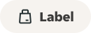
Overrides are available in design and engineering for Secondary and Tertiary buttons which have orange icons. The default icon colour token $content-interactive-brand-solid (orange) can be replaced with $content-interactive-secondary-solid (black).
This can be helpful if you need to use a Secondary or Tertiary button but the orange icon doesn’t work with the surrounding UI.

Examples
LTR examples
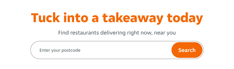
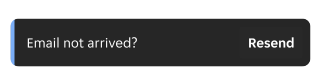
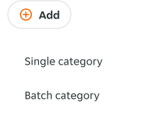
Here are some examples of Buttons in left to right context:
RTL examples
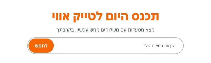
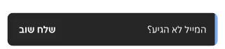
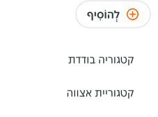
Here are some examples of Buttons in right to left context: