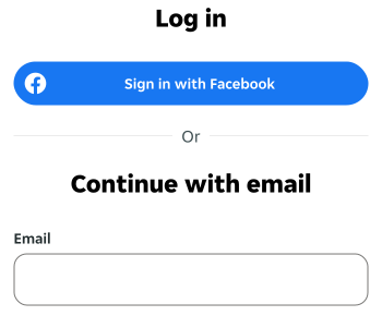
- Use a divider to separate related elements into groups or break up dense content.
- Use a divider when items can't be separated with open space.
Divider
A divider is a visual element used to create a separation or divide between sections, content or components within a user interface.
Dos and Don'ts
- Don't change the colour or stroke style of the divider.
- Don't overuse dividers and create unnecessary noise.
Anatomy
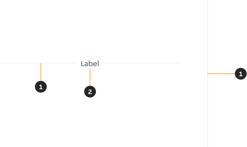
- Divider: 1px line.
- Label: Text that describes the content split by the divider.
Variants
Orientation
Horizontal

Vertical

Modifiers
Type


Label
Label is only available for the horizontal variant.

Content
- Ensure the label is clear and concise, giving users immediate understanding of the separated content.
- Use sentence case.
Examples
LTR examples
Here are some examples of the component in a left-to-right context: